Weinlaeder Seed, a trailblazer in the agricultural industry, has long been synonymous with quality and innovation. Rooted in tradition yet forward-thinking, this legacy company has been an integral part of the North Dakota and Minnesota farming community, offering top-tier seeds and unparalleled expertise.
The Challenge
Recognizing the change in the landscape of the agricultural sector, Weinlaeder sought to give its brand new life. A new farm logo design and website would do wonders to transform their business. The goal was clear: a holistic rebranding, an updated website, a fresh marketing approach, and a captivating brand video that truly reflects their heritage and forward-thinking vision while showing the down-to-earth history of the company and farm.
Our Solution
Our work with Scott and Amy Weinlaeder has been and continues to be a wonderful partnership. We embarked on a mission to revitalize their brand, ensuring it resonates with both longstanding clients and a new generation of farmers, and have continued partnering with them to help with their marketing efforts.
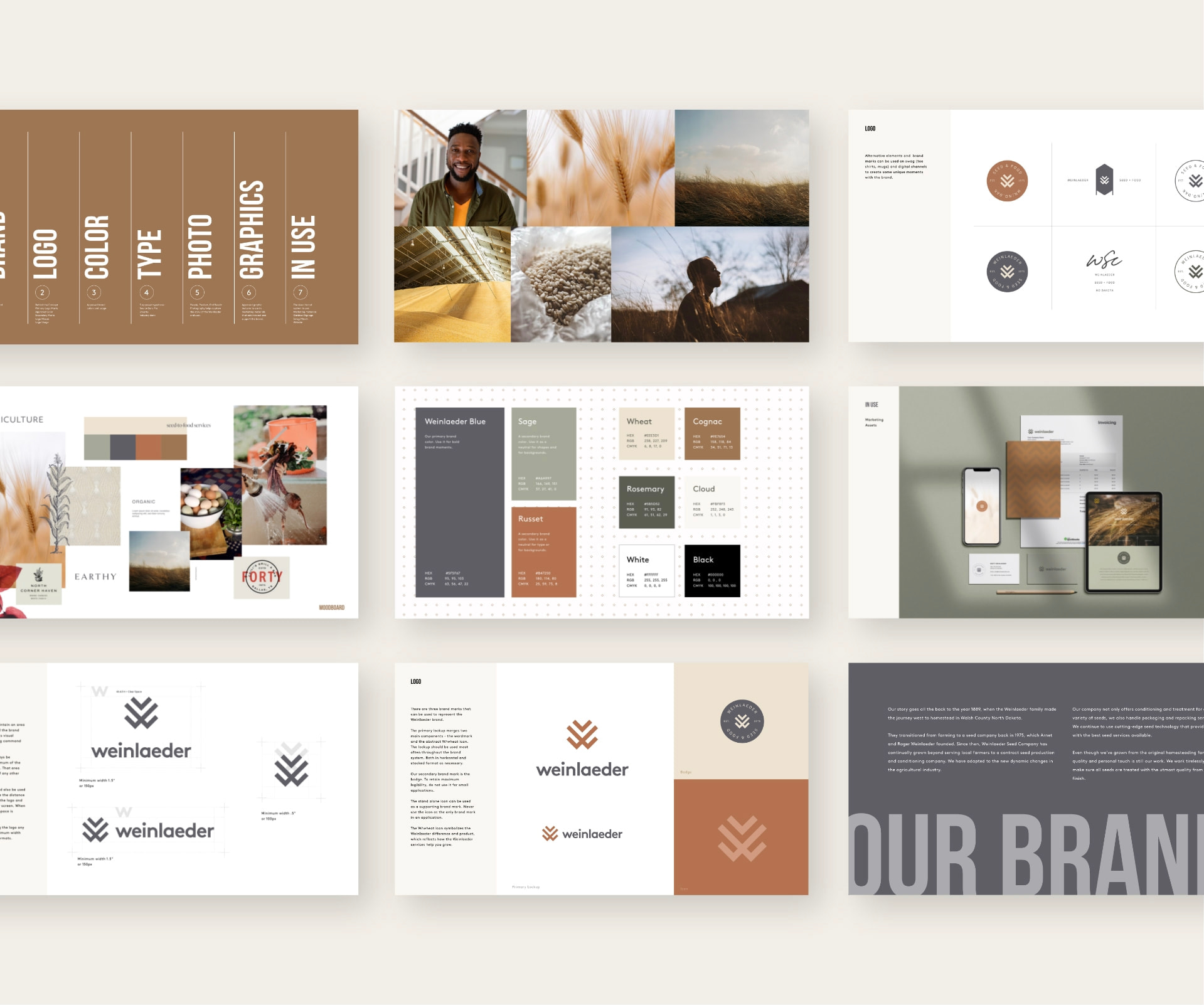
Branding + Logo
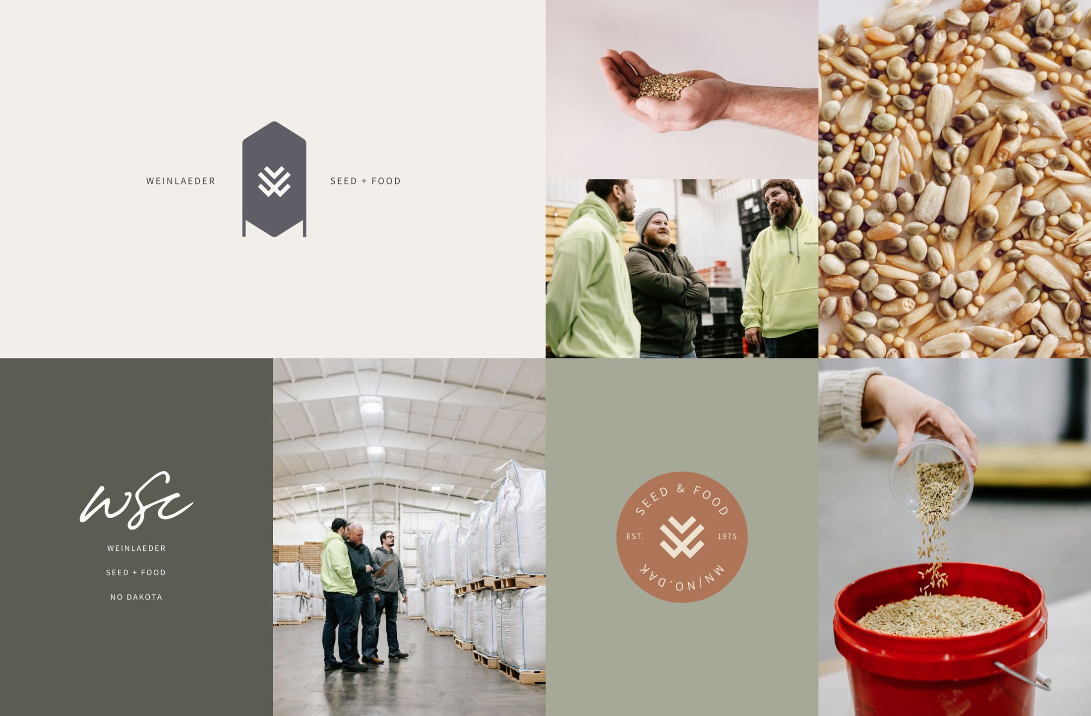
Embracing Weinlaeder Seed’s rich legacy, we crafted a brand identity that reflects both the roots and the growth of the company. The new logo brought in three key elements to make up the mark: growth, wheat, and Weinlaeder’s W. It symbolizes continued growth and distinction.
Before
After
Brand Photography
Being that we have photographers in-house (Hello, Ami and Amanda) we were able to travel north to Drayton to capture the facility in full action. The imagery tells a story of dedication, quality, and the beauty of agriculture.
Brand Story Video
It didn’t take us long to see that the Weinlaeders have a legacy with their company. This story, infused throughout their branding and marketing materials, speaks of resilience, innovation, and an unwavering commitment to the agricultural community.
Play Video
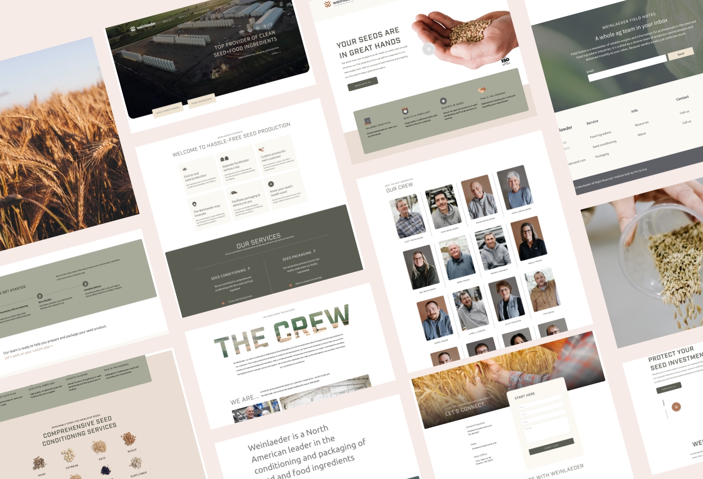
Website Design & Development
The redesigned website stands apart from agriculture websites today. It represents Weinlaeder’s voice and brand but also is informative and interactive. It guides visitors through its rich history, product offerings, and industry insights.
“Working with Finn & Gray was a transformative experience for our brand. They not only captured the essence of our identity through stunning photography and a captivating brand video but also elevated our online presence with engaging social content. The seamless rebranding process left us not just satisfied, but truly elated with the results.”
Results
Post-rebranding, Weinlaeder Seed has seen a significant uptick in engagement. Their rejuvenated brand now effectively communicates their legacy, expertise, and commitment to innovation. It became more than a mere farm logo design, they established a brand that communicates hard work and kindness. The new website has become a hub for both existing and potential clients, offering a seamless user experience that educates and inspires.
LET’S DO THIS
Design that connects and converts
to grow your business.